Once you've created a chart, you can customize the appearance of it to best present the data. You can share a chart in different formats and add a chart to a new or existing dashboard.
Use open-source charting library
You can use Nerdpacks to create your own custom visualizations. We have also teamed up with Formidable so you can use an open-source charting library, and quickly add unique "victory charts" to your New Relic One dashboards. To learn about these custom visualization Nerdpacks, watch this short video (approx. 4 minutes).
Change the appearance of your chart
When you run your query in advanced (NRQL) mode or view your chart while using the data explorer to specify data, the query builder analyzes your data and applies a chart type that fits your data.
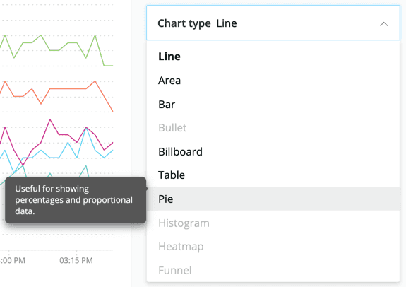
For some queries, you'll have several options of chart types to choose from. To change chart type, use the Chart type menu to the right of the current chart. Each type in the list has a tooltip with information about using that type.
Example of the chart type menu, showing a tooltip.
Customize your charts
While we try our best to optimize how we display your data, sometimes you may have other needs. Depending on the chart type, additional customization options are available.
Format date and time
Tables and billboards.
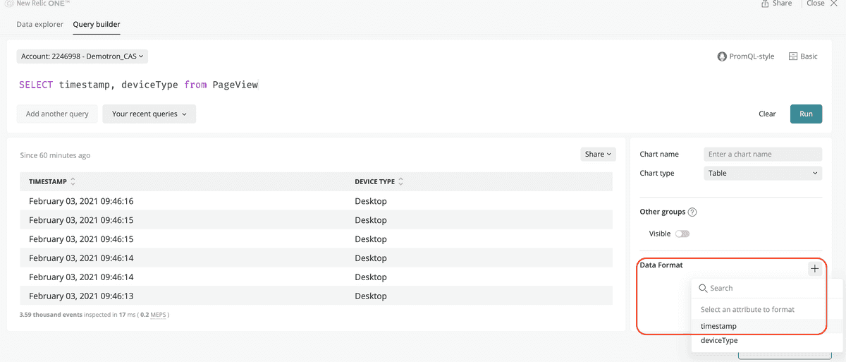
Customize the date and time format for tables and billboards: for each type of data, you can select if you want to leave it as it is, or modify the format as Numeric or Date.
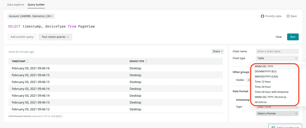
If data is a timestamp, you can choose how to represent the date and time:
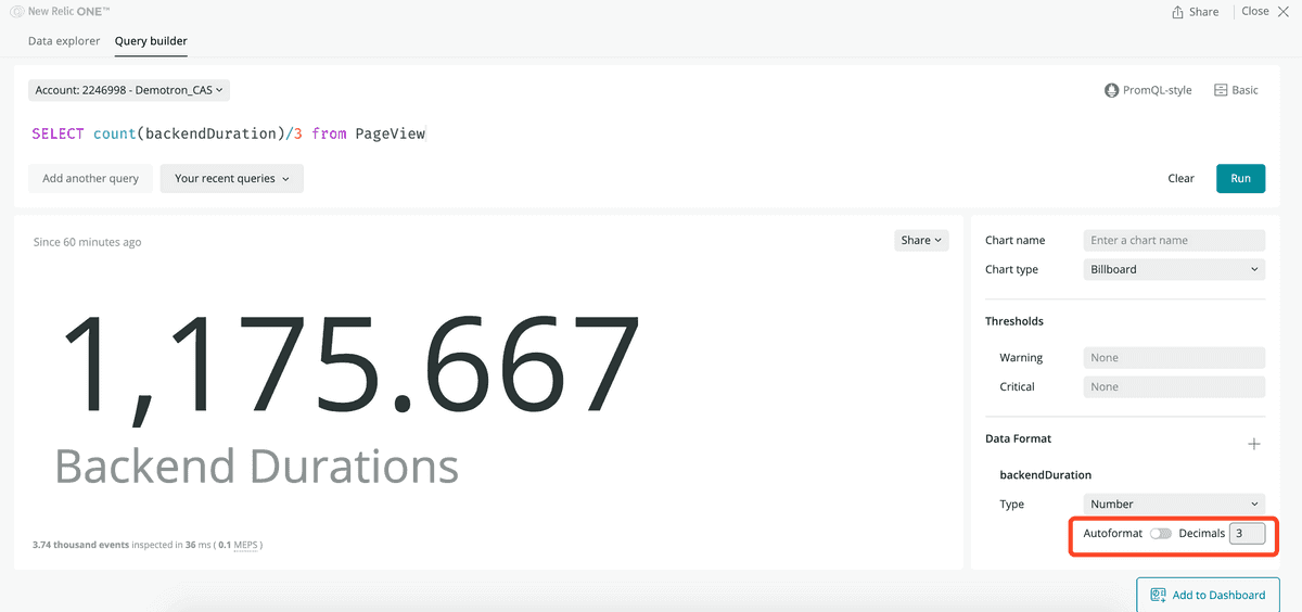
For numbers, select if you want us to auto-format them, or chose the number of decimals you want to see.
Customize the Y axis
Line charts and area charts.
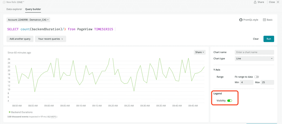
On line charts and area charts you can adjust the Y axis to display the data within certain values by setting a minimum and maximum value for the axis.
If no customization option is selected, dashboards automatically displays the full Y axis from 0 to the top value plus a margin.
Enable or disable the legend
Line charts, area charts, and histograms.
For line charts, area charts, and histograms, you can disable or enable the legend.
Remove the other groups facet
Bar charts, pie charts, and tables.
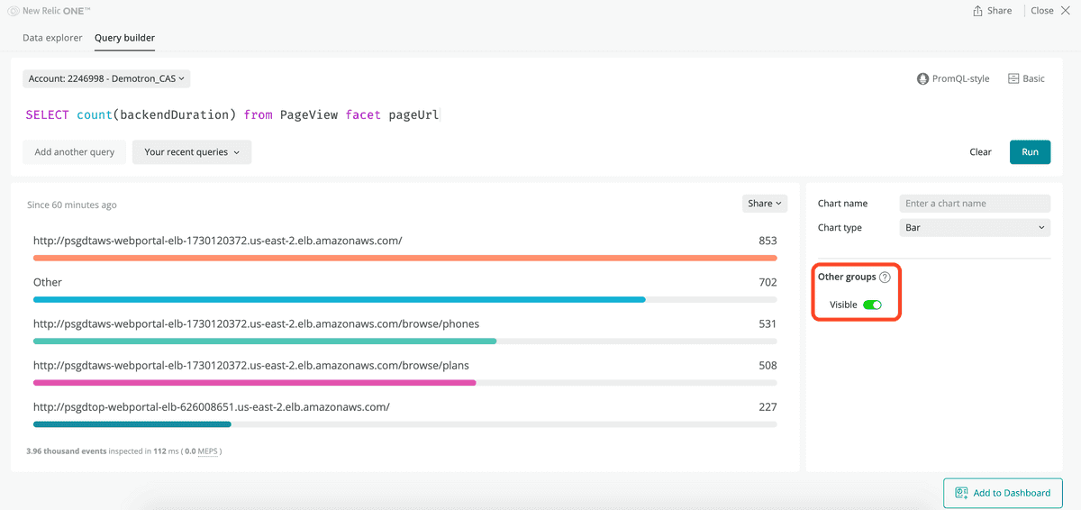
When faceting on bar charts, pie charts, or tables, and if the number of faceting on queries is larger than 2,000, the Other groups facet aggregates the rest of facets. With this customization you can select whether to see Other groups, or remove it.
More chart-specific features
For more chart type-specific features, see Chart types.
Chart share and view options
Most charts have various options, including a chart-embed option, getting a chart as an image, and adding a chart to a dashboard. To read about general chart options, see Basic UI features.
